

Cidercade
logo + brand extensions
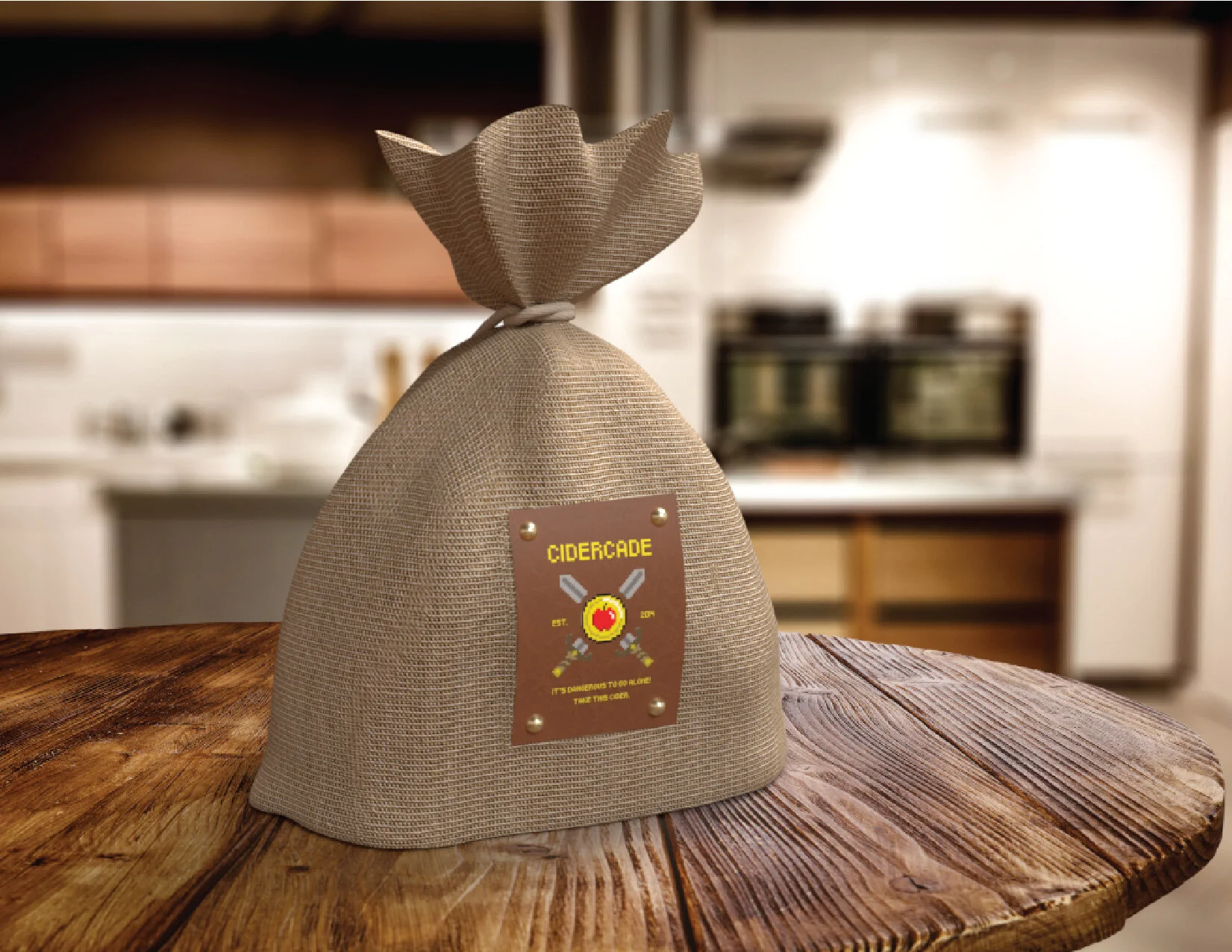
Cidercade is an existing hard cider and arcade bar with a few locations in Texas. For a WWU course project, I was tasked with designing a logo as well as an appropriately branded bag, bottle, and box. I was assigned Cidercade as the brand I would be working on which was great because it provided me the perfect opportunity to make some pixel art.
For the logo, I did some rough sketching at first. I then started using graph paper to sketch, utilizing the many squares as if each was one pixel. Eventually I dialed in the shape and size of the apple on a coin. The apple is a reference to the most common fruit in ciders, and the coin, plus the pixel art style, is in reference to the arcade aspect of the business. I went with a six pack for the box, as customers of Cidercade would want to take home their delicious cider, I made it as a variety pack with a pixel art fruit for all six flavors. I also created the decorative pixel type used for displaying the company name. For the bag I used a burlap sack, much like a “bomb bag” you would get while playing an old rpg. Complete with a riveted leather patch with an exciting graphic. The bag would be used to hold the bottle, in which I made to look like a big potion! I call it the “Enchanted Reserve” as it would be a more luxurious and higher end drink a customer could purchase.
